STONE
Luminary
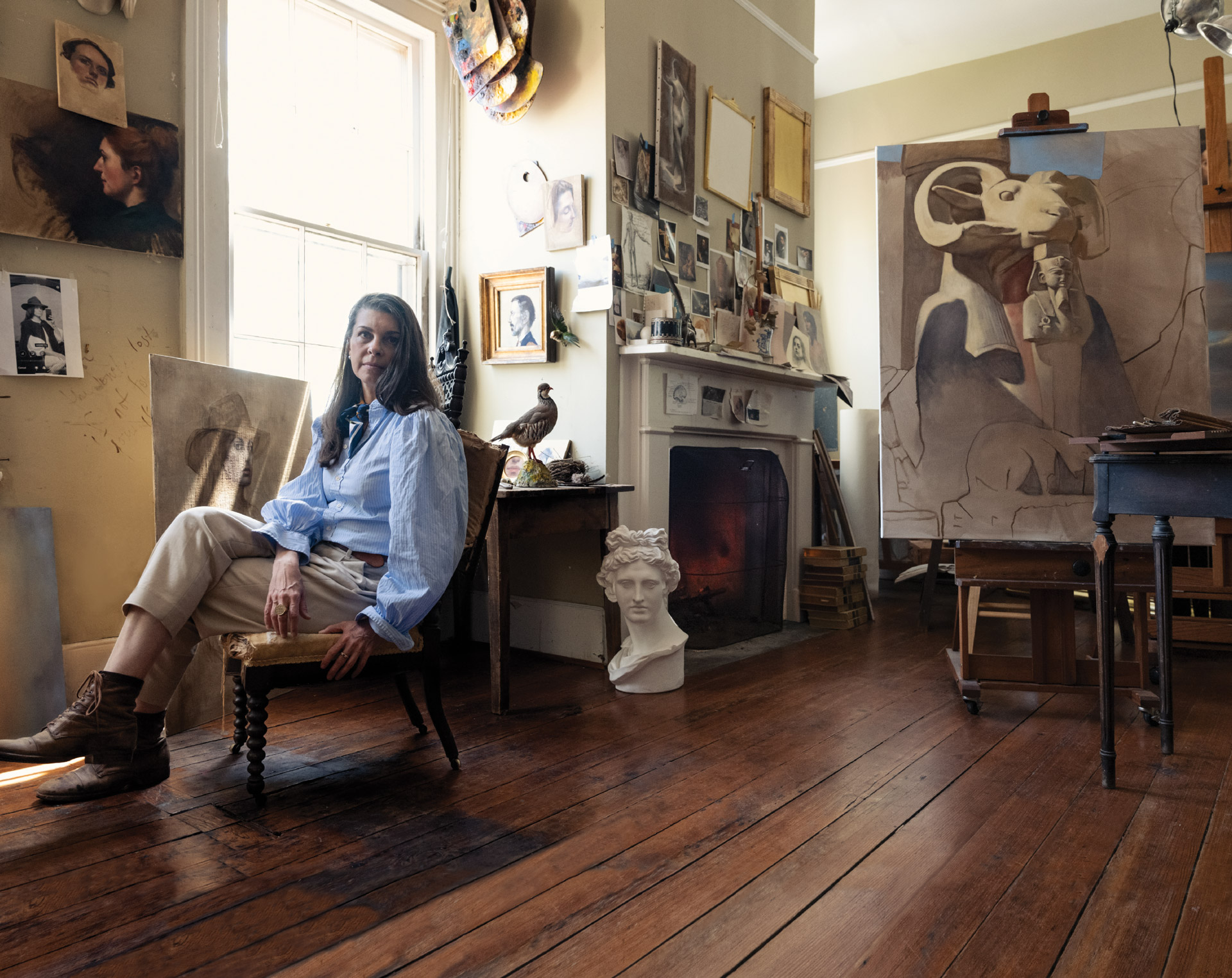
STEVEN
GAMBREL
As one would expect, Steven Gambrel’s latest personal renovation project is a masterclass in material. A top-to-bottom revamp of an 1854 brownstone in New York’s West Village, the grand space showcases many of the hallmarks and historical references that have made him an essential voice in the design world. A sneak peek, as it nears completion, reveals that Steven's liberal use of stone varieties and permutations is the true brilliance.
“with stone,
you're working with color,
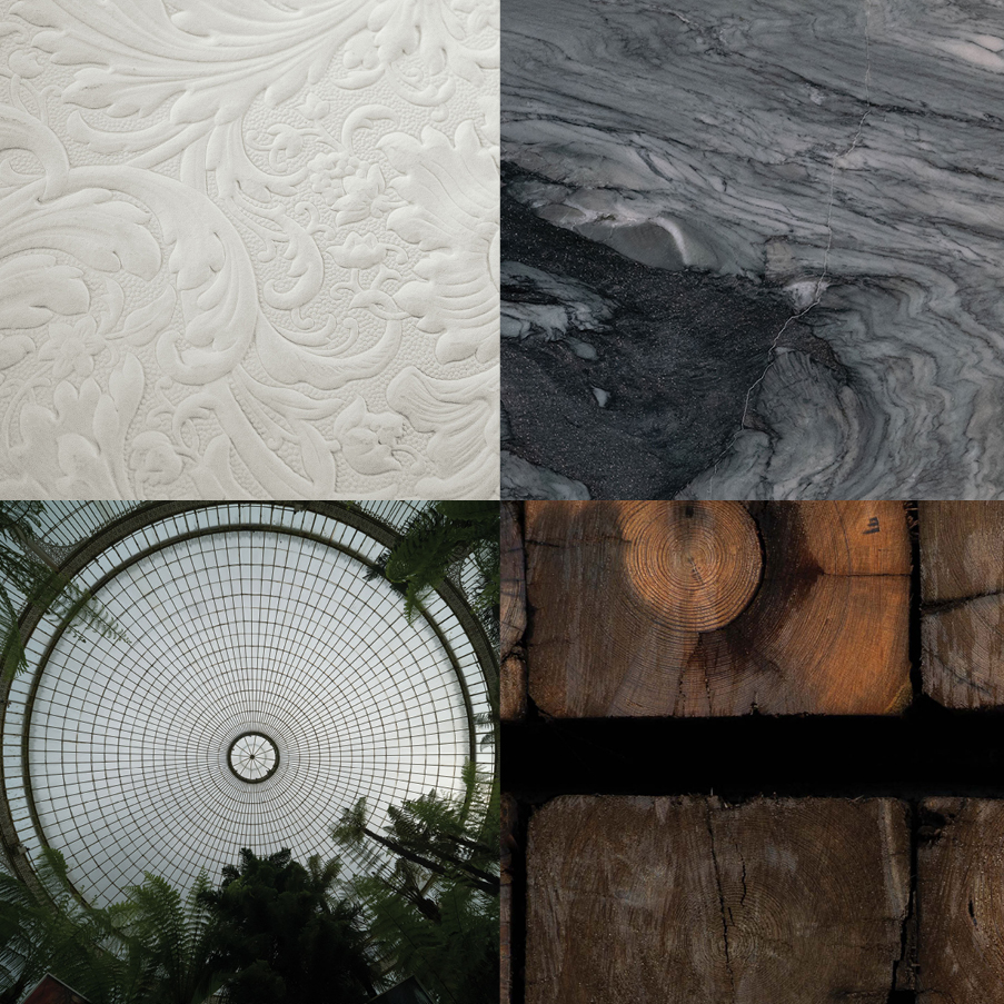
texture, NATURE, VEINING,
patterning,
so many variables.”
Steven Gambrel was always the go-to designer for interiors with strong, if subtle, historical references and even stronger color.
A longtime collaborator with Urban Electric, Steven granted us access to capture, in progress, one of his most personal projects to date, his own NYC townhouse, as it neared completion.

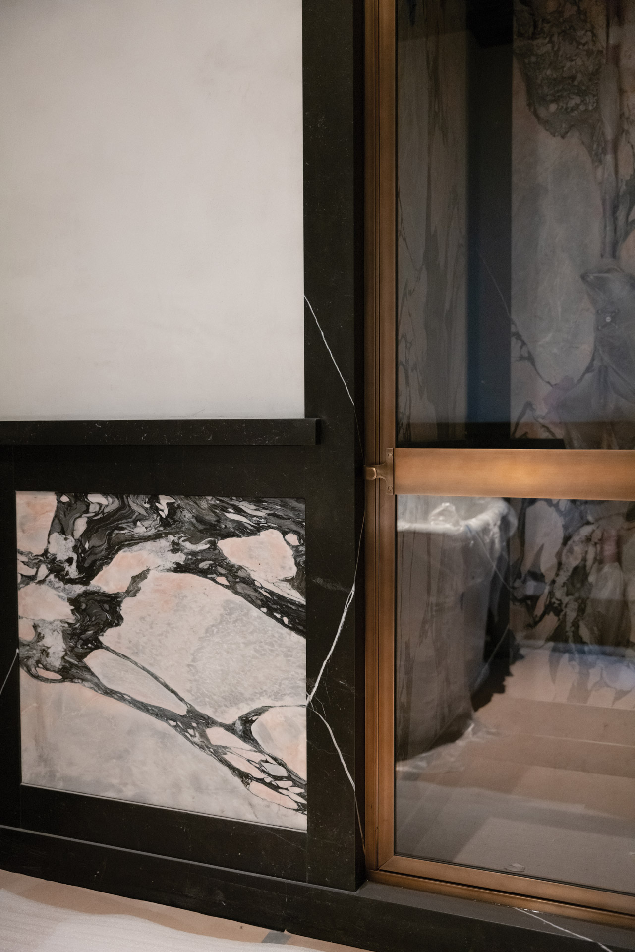
The final piece of a Black Levandia frame awaits installation atop a guest room fireplace faced in Portugal Pink Borba.
Whether the dose of color was big (an entire room spectacularly “dipped” in luscious aubergine), medium (orange inset panels of a ceiling in a wood-paneled library), or small (bright red picture frames for a collection of black and white photographs), saturated color was a statement in every one of his projects and quickly became a signature of his work.
“I viewed dense color as luxurious,”
Steven says, who, as a student of history, knows that before the development of chemically-produced paint, particular deep shades were indeed the provenance of the few and the privileged, as their pigments were derived from expensive natural materials.
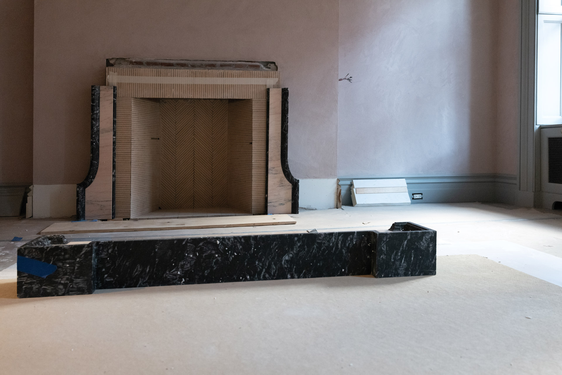
A mantelpiece of Black Kilkenny marble in a guest room.
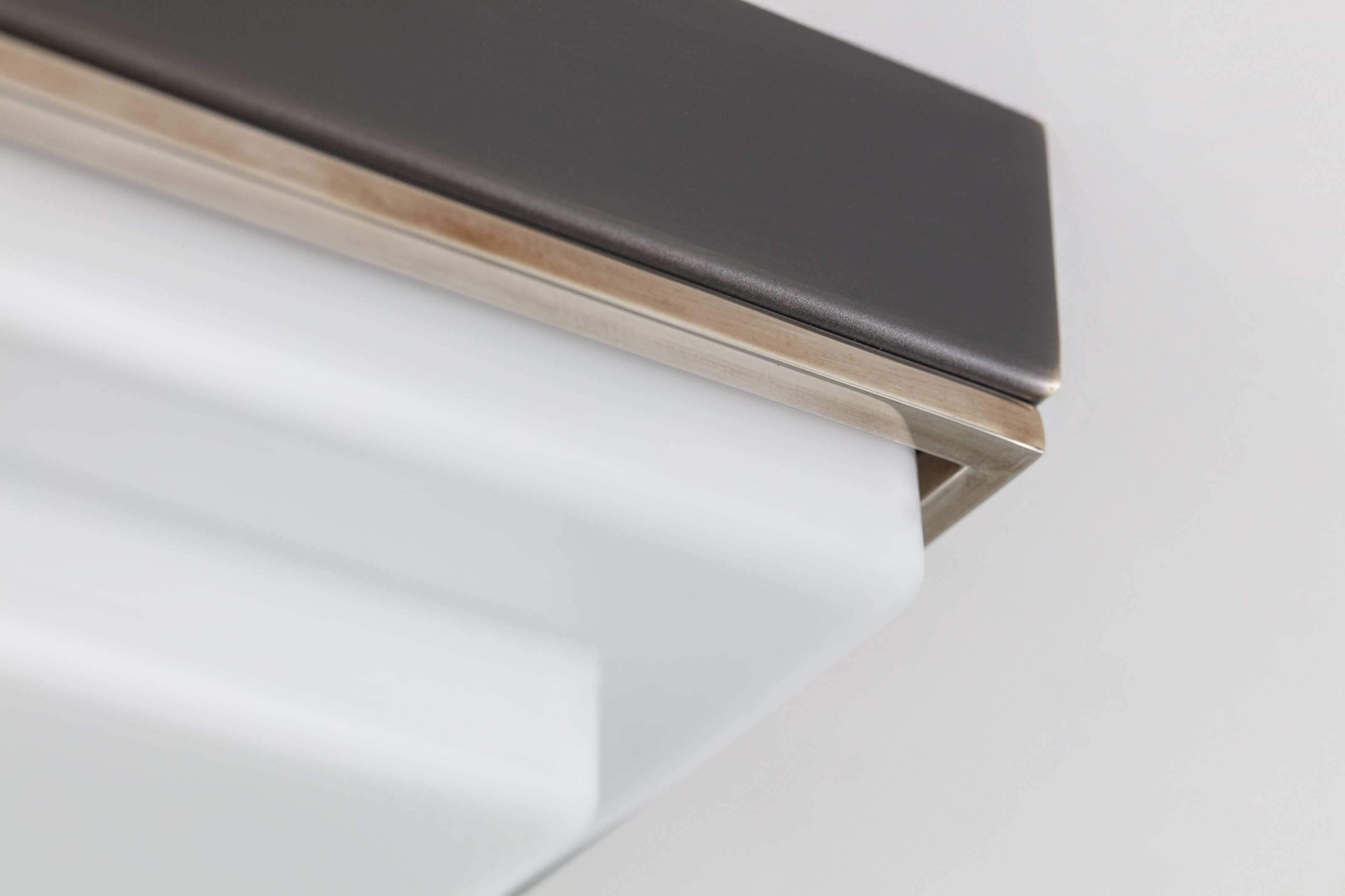
A bronze-framed shower door matches the elegance of Black Venato marble framing the doorway in a guest bathroom.
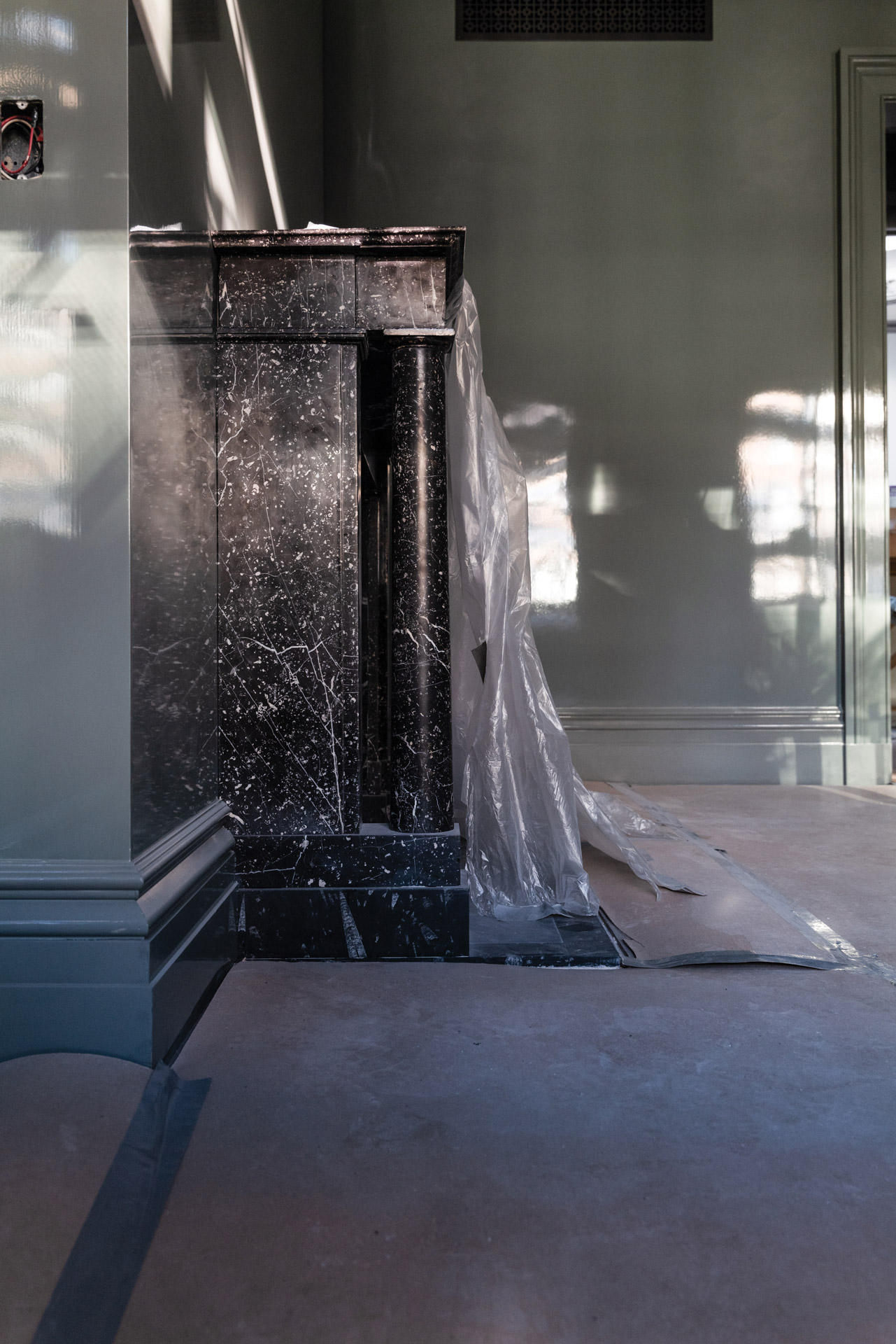
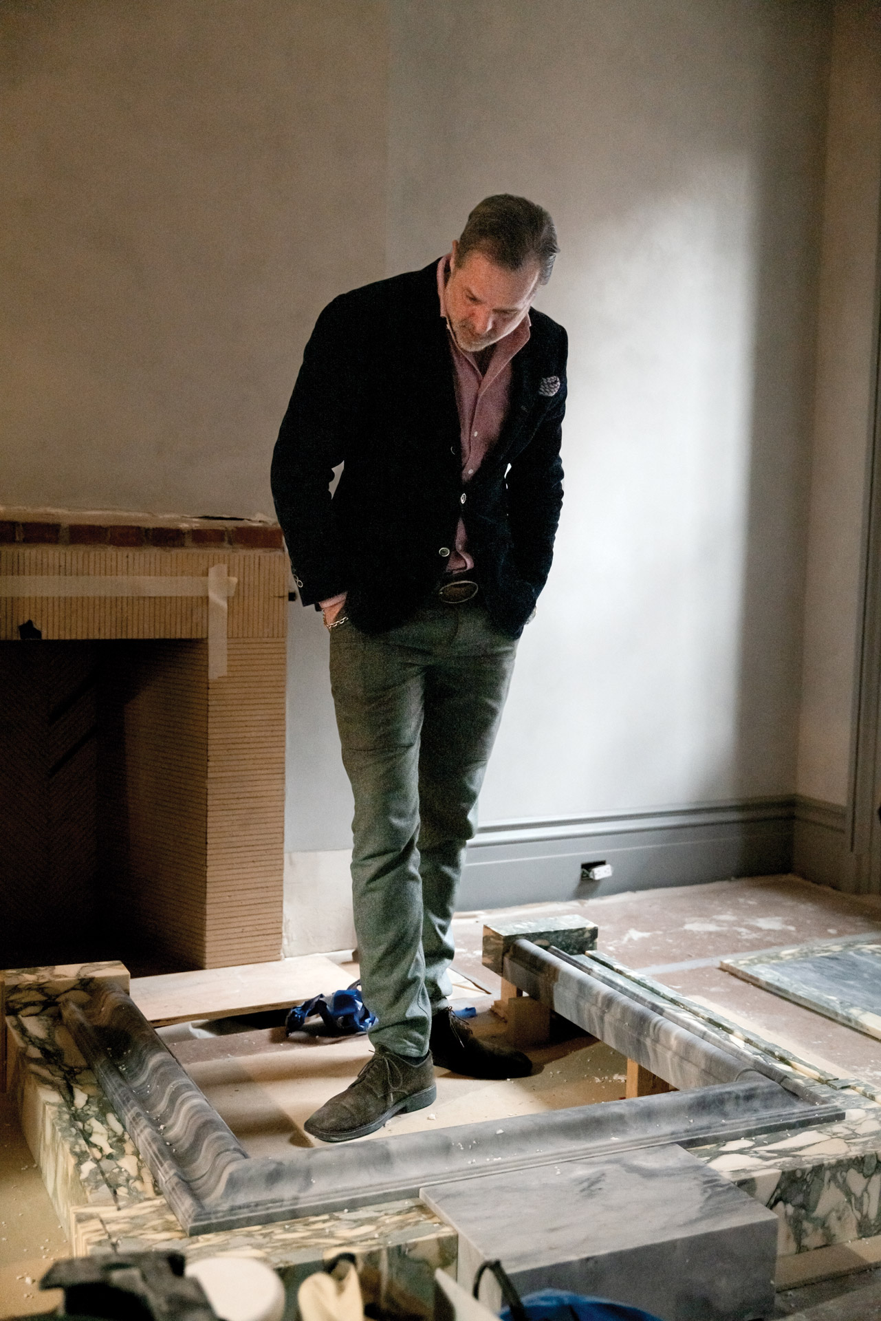
Steven inspects a mantelpiece of Breccia Verde Seravezza and Bardiglio Nuvolato he designed for his bedroom.
Steven is still known for his deft handling of color but his palette has both evolved and softened as his career has progressed.
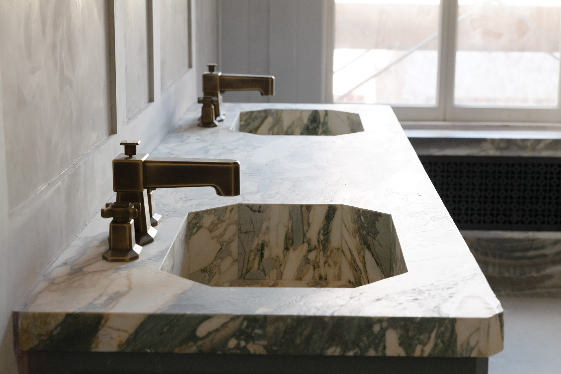
Twin octagonal sinks in the main bathroom that appear carved from a solid block were masterfully pieced together.
He now more fully appreciates the luxuriousness of materials with heft and history—
plaster, bronze, wood and stone. Materials with inherent coloration. While still enamored of the power of paint, it is stone that he studies and parses, lusts after and celebrates. Always an avid researcher, he has visited stoneyards far and wide, noted the use and handling of stone from the ancients to 20th-century architects such as Sir Edwin Lutyens and Piero Portaluppi and seems poised to join the ranks of the latter as his eye for, and skill with, stone becomes ever more refined.
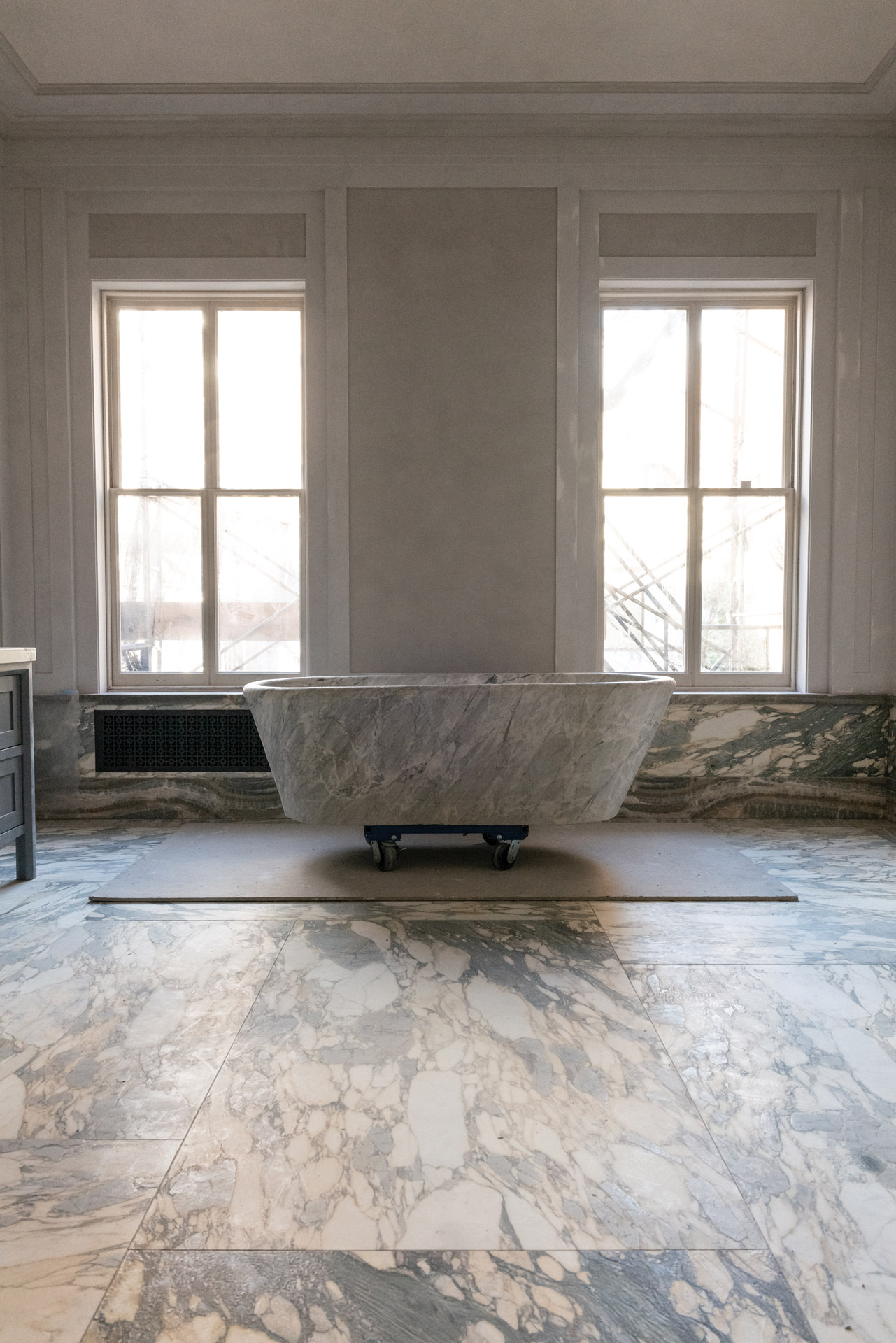
When Steven found the solid marble tub upstate, it was serving as a planter and buried under a variety of foliage.
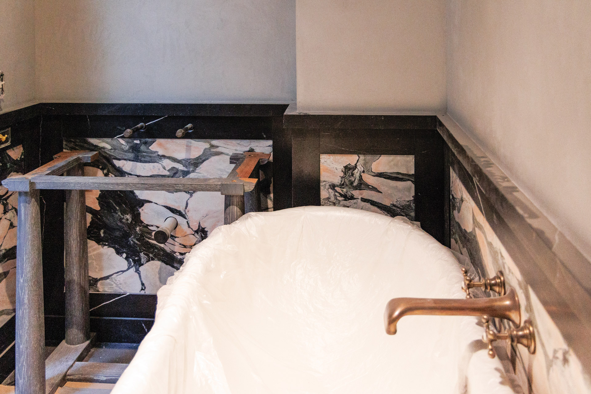
A striking composition in Black Venato marble and Midnight Rose marble in a guest bathroom.
In his latest, and he swears, last personal renovation project in New York City, Steven has indulged his utter love of stone with panache. Twenty-two different kinds crop up in nearly every room and elevate an 1854 Italianate brownstone with 13-foot ceilings on the parlor floor to an even loftier place.
Even partially finished, the main bathroom is a masterpiece of strong, natural materials (stone, plaster, bronze) coming together in an expression of utter elegance. A Birsley pendant from our most recent collection with Steven hangs overhead.
Steven's liberal use of stone varieties and permutations is true brilliance
STEVEN GAMBREL
AS TOLD TO THE URBAN ELECTRIC Co.
Ninety-nine percent of my work, I would say, is about visual framing. I think of it as a way of containing things and working out proportion. And one of my favorite things to do is to pair stones. So the working out of the framing is my architecture and the pairing of stones is my art form. Stone is such a different medium. I go to a stone yard or to my desk and pull samples, and pair, for instance, a five-inch frame with the center stone it surrounds. And when we nail it, when it's right, it is extremely rewarding.
So much of my increasing involvement with stone comes down to people and resources. Now, with technology, slabs can be photographed straight-on instead of at an angle so you get a true picture of the character of the stone. And then with the computer and Photoshop, I can play around with the layout and alignment or juxtaposition of pieces with precision and relative ease.
But the turning point for me was meeting Eliot Mazzocca of Lido Stone Works. He and I are around the same age, and we built our businesses at the same time. He’s a stone guy who is just wicked talented, but more importantly, he never says no to any detail. We build each other up. When you have someone like that in your life or in your career, the effect is you do better work.
And then there is Umberto in my office who speaks Italian. To find special stones, we went on a fabulous trip to Italy with the principals of Liederbach & Graham Architects, who introduced us to an artisan who works in cubic blocks. The liberating thing about him is he simply doesn't have an issue, whatsoever, with how a block is cut. He can take a giant piece of stone and slice it and carve it up like he’s whipping up breakfast. He just does it. And that is how I ended up with a giant sink with ridiculous details in my house in the city.
There's a certain kind of Breccia marble that I have always loved. You see it in great houses and palaces and monuments. It has a very noble kind of figuration, more of a blob-like patterning and less typical veining. I’ve used it a lot in its green and red colorations which are the most known. But for this house, I wanted an aspect of a palace from Milan from the thirties, and I was after a Breccia that was warmer, even though yellow is my least favorite color. With paint you’re working primarily with color plus variations in finish; with stone, you're working with color, texture, nature, veining, patterning, so many variables.
In Italy we found this block of Breccia Verde Seravezza and it was exactly perfect. It’s spectacular, ancient, fabulous. I had a sample in my office, and I started trying to pair it because I knew I wanted a different stone for a border and baseboards. Had this been for a client coming in for their big presentation, I would have chosen this dark green stone that we have. The pairing was completely beautiful except for the fact that it's not what I wanted. For me, the contrast was just too exaggerated.
I had this piece of Breccia out on the desk for weeks and tried pairing it with every stone we have in our sample library (and we have, thanks to the generosity of our vendors, well over 500). Then I went out to every single stone yard with my piece in hand, and I held it up to a hundred other pieces of stone. All along in my office, was a small sample of a piece of onyx that I had passed over because I find onyx sometimes to be too rich, especially when it’s polished. And this piece was really warm, verging on melted caramel. But every time we put it next to the Breccia, the pairing just worked. Together they were stunningly beautiful.
Because I like my house to be the ultimate challenge, we went with the onyx. There are moments where the risk is high and this pairing was one of them. You know, it’s like when you see someone on the street and they will have on something like plaid upon plaid and a stripe in the plaid and you're like, whoa. There's a moment where it can work, but it can also fail deeply. Just like how you cut pieces of stone; if it's done wrong or if the finish is wrong, it's just a mess.
But in this case I was also pairing the stone with the extremely refined workmanship of brilliant Eliot. He’s a master at delivering a beautiful Roman finish, taking it from pitted to honed to sueded to this soft antique texture. And he knows how to get the best out of a block, to extract the best veining and still leave you with the lovely quieter slabs. I tend to use slabs with greater veining on horizontal surfaces and the quiet ones vertically.
Long ago I learned a valuable lesson, one of those happy accidents that is so instructive. There was a limited amount of a particular stone I loved that I wanted to use in a room so I had to start reducing its coverage on the walls. I ended up adding Venetian plaster, and the result was a better balance. Less weight physically but more importantly, less weight visually, and still a sense of dimension and materiality. That is the approach I took to my bathroom.
Beyond the pairing of the two stones, what I eventually realized was that every surface in the room (the border stone, the center stone, the plaster walls, the bronze hardware, the fumed oak floors leading to the bathroom) had to cancel the others out so that nothing spoke too loudly. And each needed to carry its own weight and measure up to the others in terms of materiality. Painted drywall is a weak link when you’re dealing with natural materials, especially this much stone. If you get every detail to a certain level, if you keep all your choices equally strong, if you keep the volume of quality and consistency up on every material, it actually quiets the whole story, it balances it.